Overview
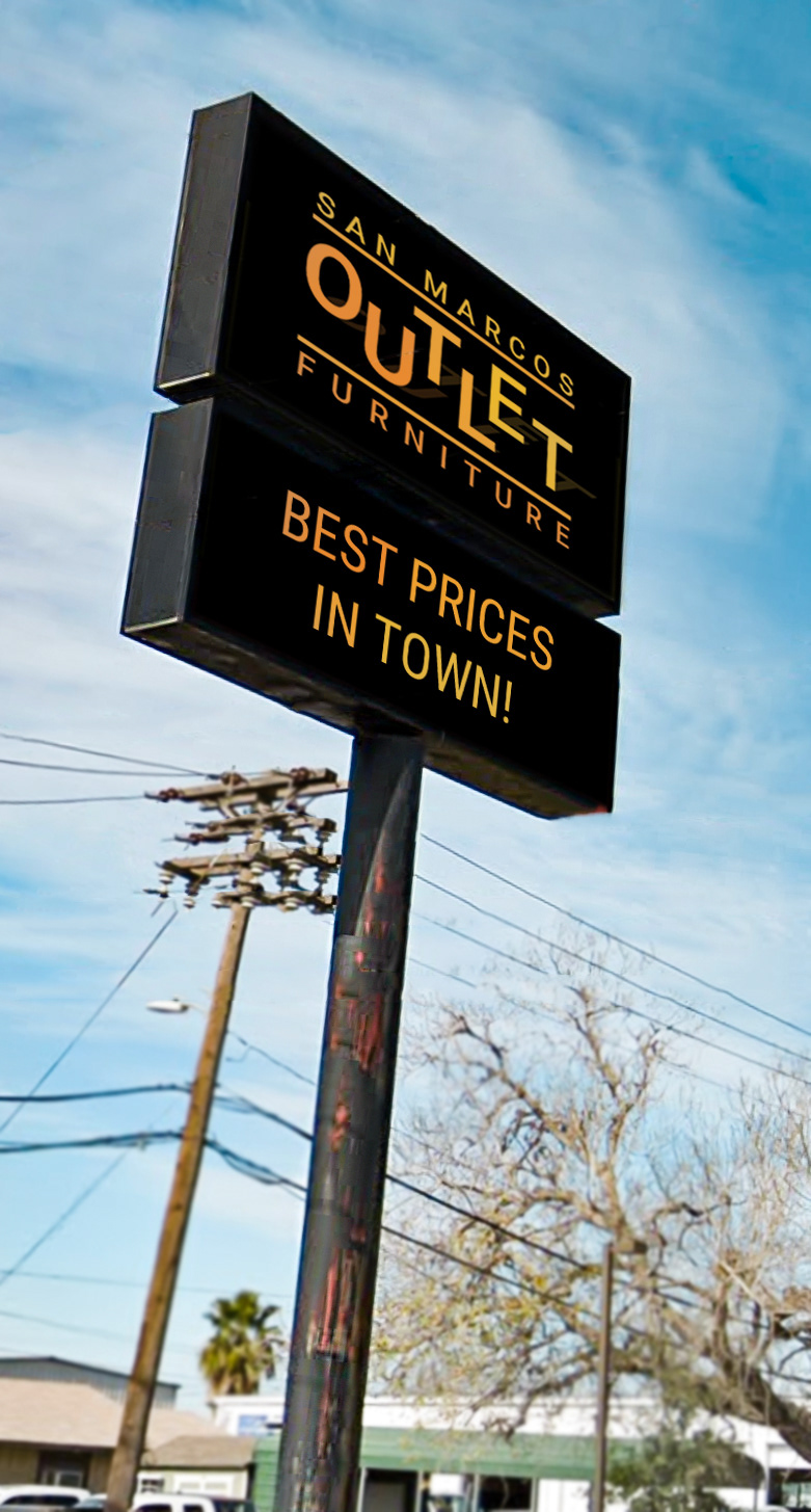
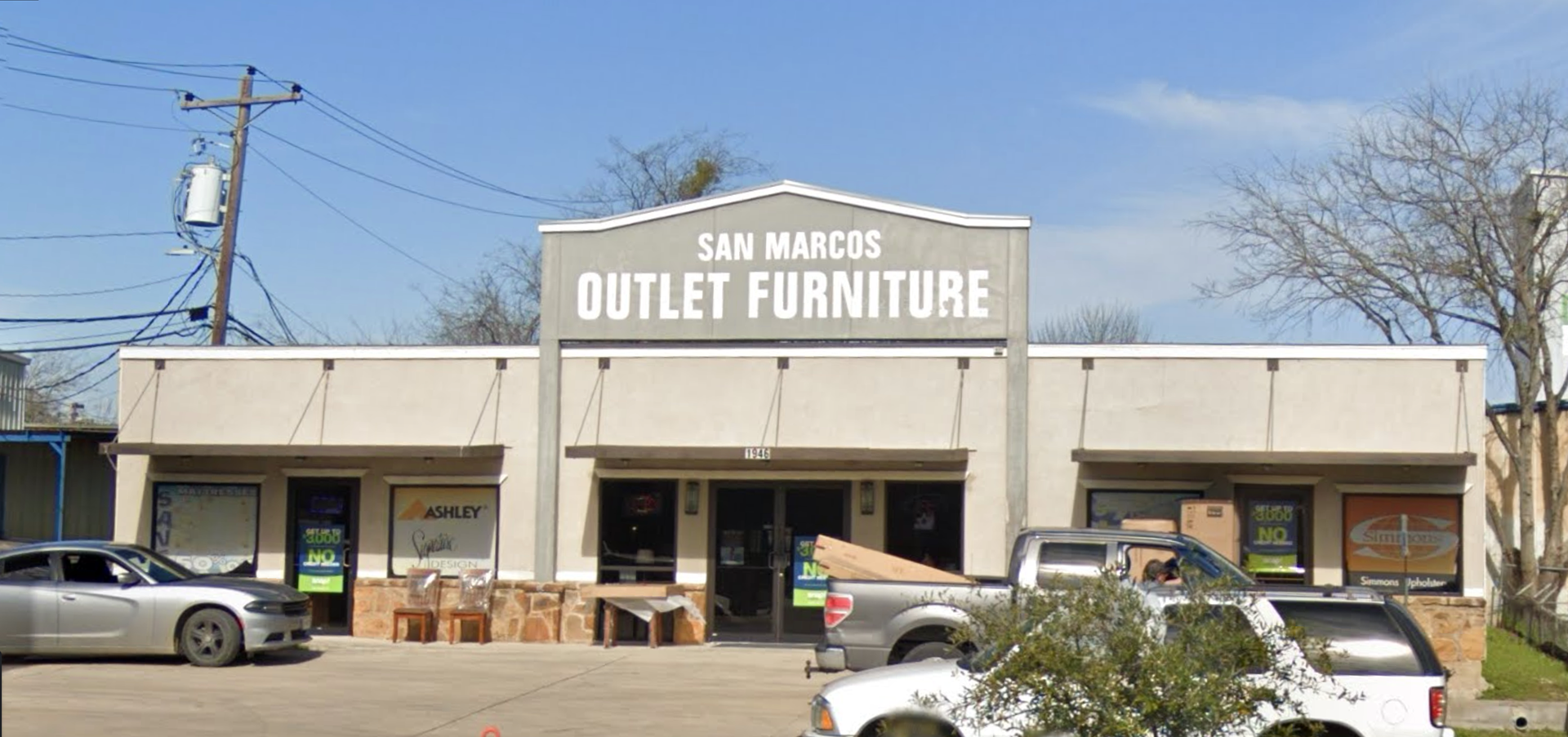
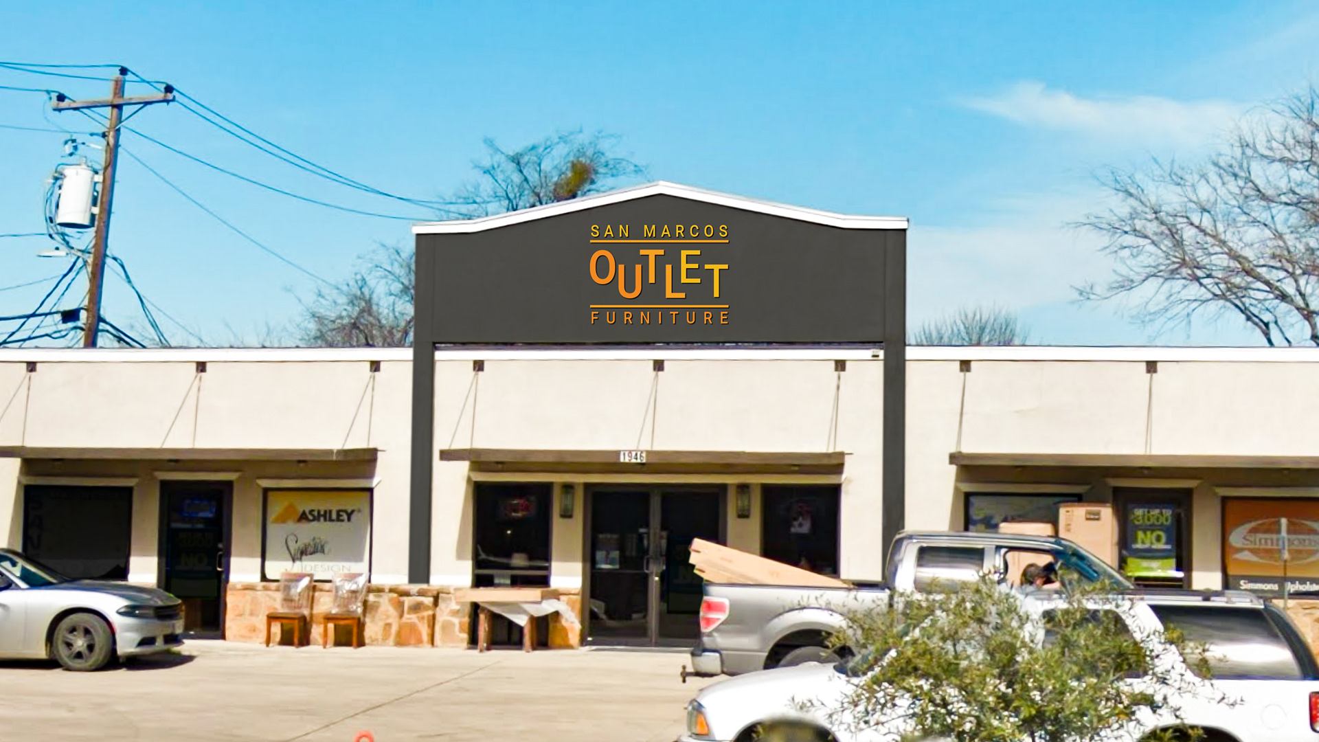
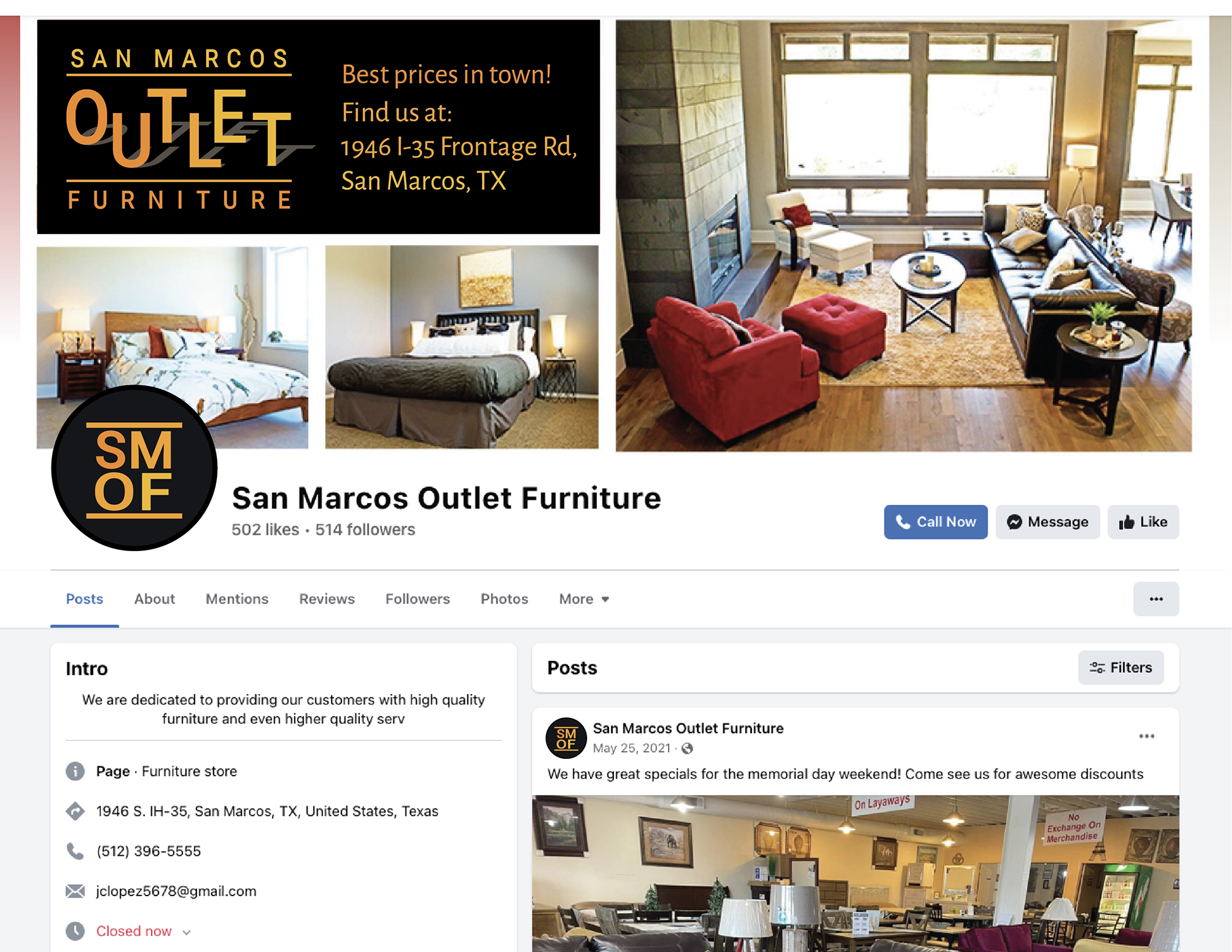
San Marcos Outlet Furniture is a local business that was chosen for an art direction presentation to show how they could modernize their branding. Showing how they could still keep bright and bold colors, but in a way that lifts up their image to a more luxurious feeling.
Approach
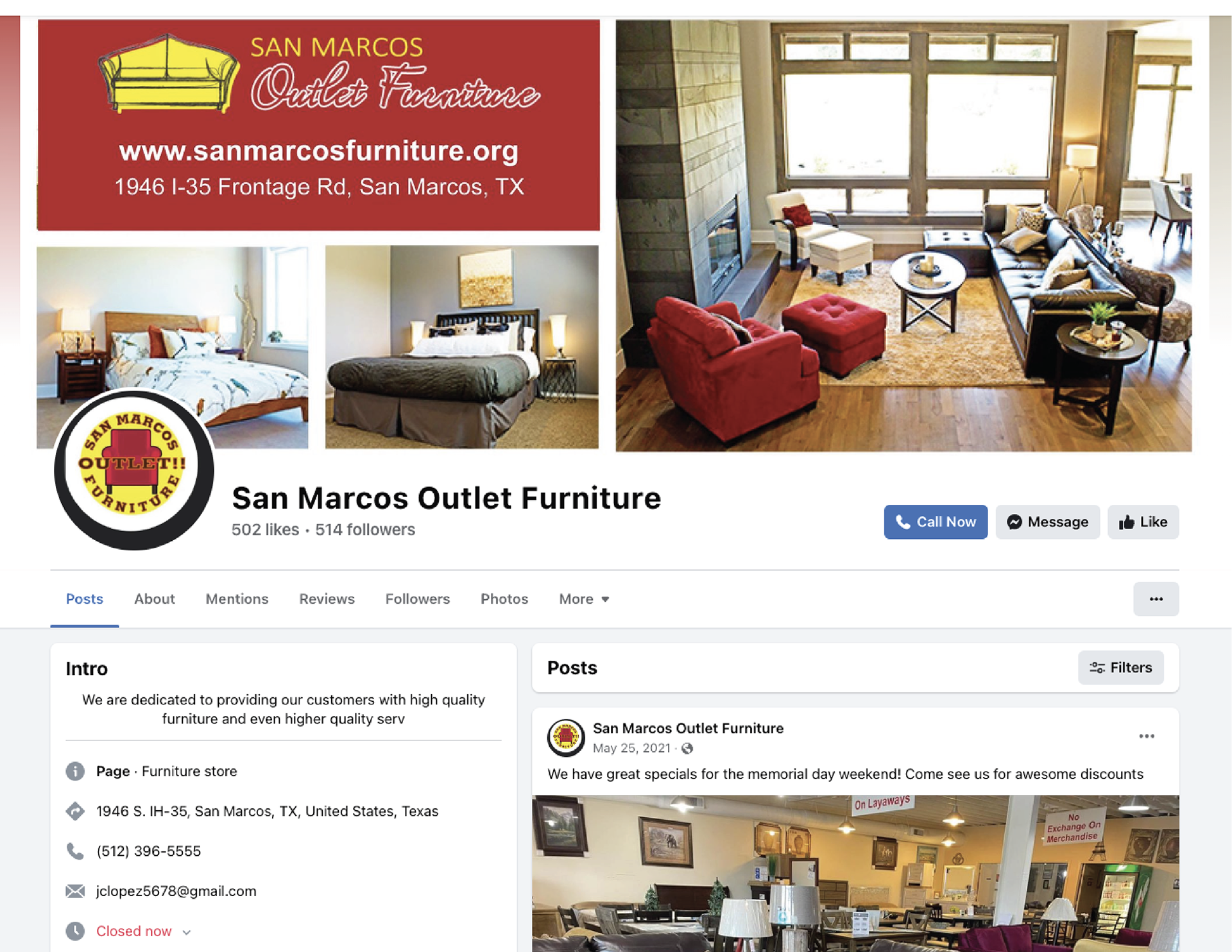
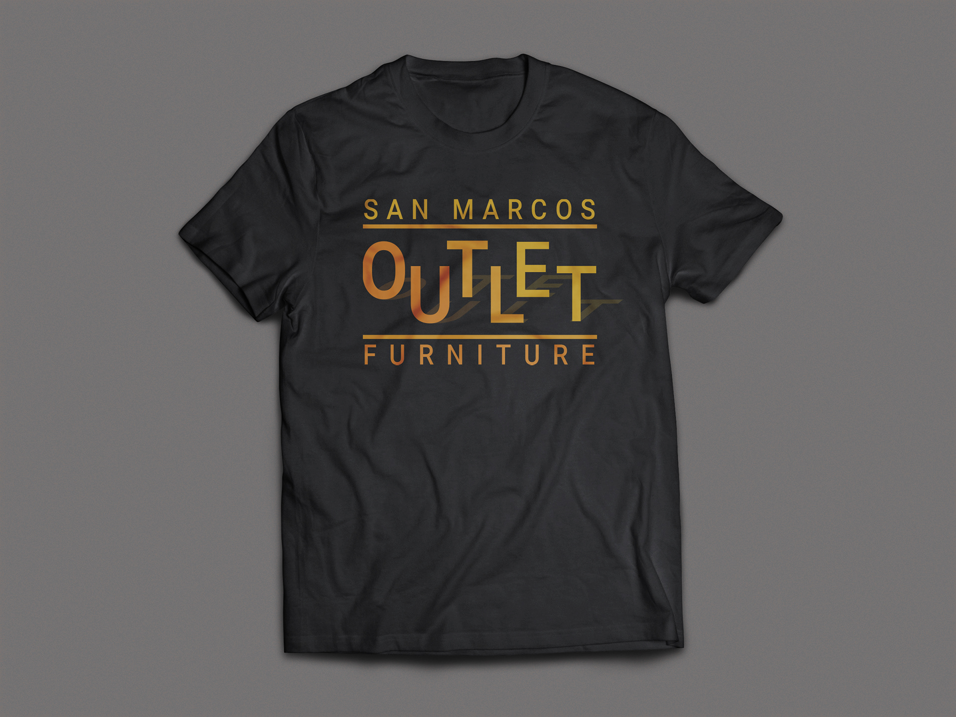
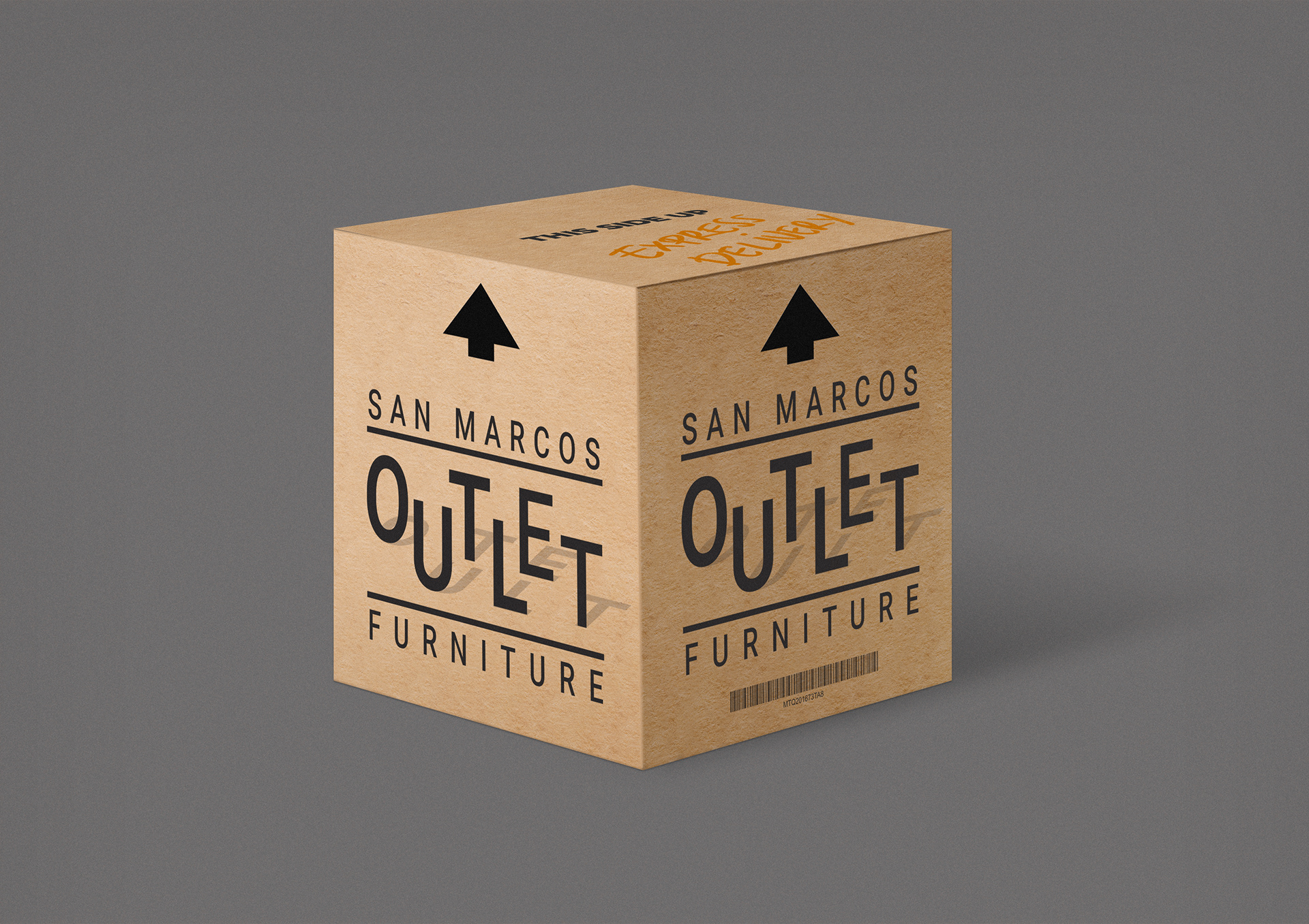
The first step was to remove the chair and focus on their unique aspect, the outlet part which refers to them being right off the freeway. The letters in outlet were offset and given a shadow to convey a 3D feeling. Yellow and orange, paired with black create contrast.
CURRENT LOGO
PROPOSED LOGO

